| Title: | Generates a Visualization of Classifier Performance as a Grid of Diagnostic Plots |
| Version: | 1.4.0 |
| Description: | Generates a visualization of binary classifier performance as a grid of diagnostic plots with just one function call. Includes ROC curves, prediction density, accuracy, precision, recall and calibration plots, all using ggplot2 for easy modification. Debug your binary classifiers faster and easier! |
| Depends: | R (≥ 3.1), ggplot2 (≥ 2.2), data.table (≥ 1.10), |
| Imports: | Rcpp (≥ 0.12), grid, ROCR, caret, gridExtra (≥ 2.2), stats, utils, png, |
| Suggests: | testthat, |
| License: | BSD 3-clause License + file LICENSE |
| Encoding: | UTF-8 |
| BugReports: | https://github.com/adefazio/classifierplots/issues |
| URL: | https://github.com/adefazio/classifierplots |
| LazyData: | true |
| RoxygenNote: | 5.0.1 |
| NeedsCompilation: | no |
| Packaged: | 2020-10-12 15:27:37 UTC; adefazio |
| Author: | Aaron Defazio [aut, cre], Huw Campbell [aut] |
| Maintainer: | Aaron Defazio <aaron.defazio@gmail.com> |
| Repository: | CRAN |
| Date/Publication: | 2020-10-13 23:40:06 UTC |
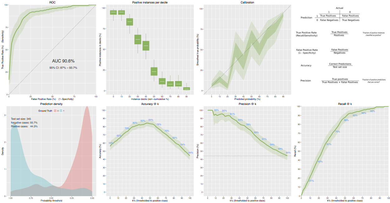
The main functions you want are classifierplots or classifierplots_folder.
Description
The main functions you want are classifierplots or classifierplots_folder.
Produce a suit of classifier diagnostic plots
Usage
classifierplots(test.y, pred.prob)
Arguments
test.y |
List of know labels on the test set |
pred.prob |
List of probability predictions on the test set |
Details
Examples
## Not run:
 classifierplots(example_predictions$test.y, example_predictions$pred.prob)

## End(Not run)
accuracy_plot
Description
Returns a ggplot2 plot object containing an accuracy @ percentile plot
Usage
accuracy_plot(test.y, pred.prob, granularity = 0.02, show_numbers = T)
Arguments
test.y |
List of know labels on the test set |
pred.prob |
List of probability predictions on the test set |
granularity |
Default 0.02, probability step between points in plot. |
show_numbers |
Show values as numbers above the plot line |
calculate_auc
Description
Compute auc from predictions and truth
Usage
calculate_auc(test.y, pred.prob)
Arguments
test.y |
List of know labels on the test set |
pred.prob |
List of probability predictions on the test set |
Value
auc
calibration_plot
Description
Returns a ggplot2 plot object containing a smoothed propensity @ prediction level plot
Usage
calibration_plot(test.y, pred.prob)
Arguments
test.y |
List of know labels on the test set |
pred.prob |
List of probability predictions on the test set |
classifierplots_folder
Description
Produce a suit of classifier diagnostic plots, saving to disk.
Usage
classifierplots_folder(test.y, pred.prob, folder, height = 5, width = 5)
Arguments
test.y |
List of know labels on the test set |
pred.prob |
List of probability predictions on the test set |
folder |
Directory to save plots into |
height |
height of separately saved plots |
width |
width of separately saved plots |
density_plot
Description
Returns a ggplot2 plot object containing a score density plot.
Usage
density_plot(test.y, pred.prob)
Arguments
test.y |
List of know labels on the test set |
pred.prob |
List of probability predictions on the test set |
Generated using the gen_example included in the github source
Description
Generated using the gen_example included in the github source
lift_plot
Description
Returns a ggplot2 plot object containing an precision @ percentile plot
Usage
lift_plot(test.y, pred.prob, granularity = 0.02, show_numbers = T)
Arguments
test.y |
List of know labels on the test set |
pred.prob |
List of probability predictions on the test set |
granularity |
Default 0.02, probability step between points in plot. |
show_numbers |
Show numbers at deciles T/F default T. |
notation_key_plot
Description
Produces some definitions as a grid.
Usage
notation_key_plot()
positives_plot
Description
Returns a ggplot2 plot object containing an positives-per-decile plot.
Usage
positives_plot(test.y, pred.prob)
Arguments
test.y |
List of know labels on the test set |
pred.prob |
List of probability predictions on the test set |
precision_plot
Description
Returns a ggplot2 plot object containing an precision @ percentile plot
Usage
precision_plot(test.y, pred.prob, granularity = 0.02, show_numbers = T)
Arguments
test.y |
List of know labels on the test set |
pred.prob |
List of probability predictions on the test set |
granularity |
Default 0.02, probability step between points in plot. |
show_numbers |
Show numbers at deciles T/F default T. |
propensity_plot
Description
Returns a ggplot2 plot object containing an propensity @ percentile plot
Usage
propensity_plot(test.y, pred.prob, granularity = 0.02)
Arguments
test.y |
List of know labels on the test set |
pred.prob |
List of probability predictions on the test set |
granularity |
Default 0.02, probability step between points in plot. |
recall_plot
Description
Returns a ggplot2 plot object containing an sensitivity @ percentile plot
Usage
recall_plot(test.y, pred.prob, granularity = 0.02, show_numbers = T)
Arguments
test.y |
List of know labels on the test set |
pred.prob |
List of probability predictions on the test set |
granularity |
Default 0.02, probability step between points in plot. |
show_numbers |
Show numbers at deciles T/F default T. |
roc_plot
Description
Produces a smoothed ROC curve as a ggplot2 plot object. A confidence interval is produced using bootstrapping, although it is turned off by default if you have a large dataset.
Usage
roc_plot(test.y, pred.prob, resamps = 2000, force_bootstrap = NULL)
Arguments
test.y |
List of know labels on the test set |
pred.prob |
List of probability predictions on the test set |
resamps |
How many bootstrap samples to use |
force_bootstrap |
True/False to force or force off bootstrapping. |
sigmoid
Description
Logistic sigmoid function, that maps any real number to the [0,1] interval. Supports vectors of numeric.
Usage
sigmoid(x)
Arguments
x |
data |