
![]()
![]()
A novel visualization technique for plotting timestamped events on a 24-hour circular clock face. The clockplot package helps you uncover daily patterns, event clusters, and gaps in your temporal data.
The approach generalizes to other cycles—like weeks and months—making it an essential tool for visualizing rhythms and planning events across any timeframe.
You can install the latest version from CRAN with:
install.packages("clockplot")You can install the development version of clockplot from GitHub with:
# install.packages("pak")
pak::pak("mahmudstat/clockplot")Click here to
visit the repository and follow the website (mentioned on the
About section) to see all the available functions.
Below we mention some relevant applications.
The data is taken from Kaggle and a small part (100 rows) extracted. To see the modified data, visit this link.
library(clockplot)
acdt <- read.csv("https://raw.githubusercontent.com/mahmudstat/open-analysis/main/data/usacc.csv")
clock_chart_qnt(acdt, time = Time, len = Humidity..., Col = Temperature.F.) +
  ggplot2::labs(size = "Humidity", color = "Temperature")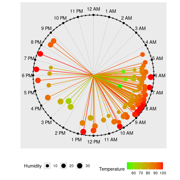
This allows us to observe when the accidents occurred and how temperature and humidity may be associated with them.
We have a small data of times of messages received throughout a particular day, along with sender of the messages and their types. Let us the pattern of messages by senders.

Generally, there is cyclic_chart(), allowing to plot
daily, weekly, or monthly values or agenda on a circular plot. There are
some specific functions as well, relating to day, week etc.

The charts produce ggplot objects, so you can make use
of many of the functions of the ggplot2 package. You can
use the labs function, for example, to add
title, subtitle, caption etc.
Some examples are shown in the next segment.
You can also add legend or change its position by using the code
theme(legend.position = "right"); the accepted positions
are top, bottom, left, and
right.