Plot a combination matrix instead of the standard x-axis and create UpSet plots with ggplot2.
You can install the released version of ggupset from CRAN with:
# Download package from CRAN
install.packages("ggupset")

# Or get the latest version directly from GitHub
devtools::install_github("const-ae/ggupset")This is a basic example which shows you how to solve a common problem:
# Load helper packages
library(ggplot2)
library(tidyverse, warn.conflicts = FALSE)
#> ── Attaching core tidyverse packages ──────────────────────── tidyverse 2.0.0 ──
#> ✔ dplyr     1.1.4     ✔ readr     2.1.5
#> ✔ forcats   1.0.0     ✔ stringr   1.5.1
#> ✔ lubridate 1.9.3     ✔ tibble    3.2.1
#> ✔ purrr     1.0.2     ✔ tidyr     1.3.1
#> ── Conflicts ────────────────────────────────────────── tidyverse_conflicts() ──
#> ✖ dplyr::filter() masks stats::filter()
#> ✖ dplyr::lag()    masks stats::lag()
#> ℹ Use the conflicted package (<http://conflicted.r-lib.org/>) to force all conflicts to become errors

# Load my package
library(ggupset)
In the following I will work with a tidy version of the movies
dataset from ggplot. It contains a list of all movies in IMDB, their
release data and other general information on the movie. It also
includes a list column that contains annotation to which
genre a movie belongs (Action, Drama, Romance etc.)
tidy_movies
#> # A tibble: 50,000 × 10
#>    title       year length budget rating votes mpaa  Genres stars percent_rating
#>    <chr>      <int>  <int>  <int>  <dbl> <int> <chr> <list> <dbl>          <dbl>
#>  1 Ei ist ei…  1993     90   NA      8.4    15 ""    <chr>      1            4.5
#>  2 Hamos sto…  1985    109   NA      5.5    14 ""    <chr>      1            4.5
#>  3 Mind Bend…  1963     99   NA      6.4    54 ""    <chr>      1            0
#>  4 Trop (peu…  1998    119   NA      4.5    20 ""    <chr>      1           24.5
#>  5 Crystania…  1995     85   NA      6.1    25 ""    <chr>      1            0
#>  6 Totale!, …  1991    102   NA      6.3   210 ""    <chr>      1            4.5
#>  7 Visibleme…  1995    100   NA      4.6     7 ""    <chr>      1           24.5
#>  8 Pang shen…  1976     85   NA      7.4     8 ""    <chr>      1            0
#>  9 Not as a …  1955    135    2e6    6.6   223 ""    <chr>      1            4.5
#> 10 Autobiogr…  1994     87   NA      7.4     5 ""    <chr>      1            0
#> # ℹ 49,990 more rows
ggupset makes it easy to get an immediate impression how
many movies are in each genre and their combination. For example there
are slightly more than 1200 Dramas in the set, more than 1000 which
don’t belong to any genre and ~170 that are Comedy and Drama.
tidy_movies %>%
  distinct(title, year, length, .keep_all=TRUE) %>%
  ggplot(aes(x=Genres)) +
    geom_bar() +
    scale_x_upset(n_intersections = 20)
#> Warning: Removed 100 rows containing non-finite outside the scale range
#> (`stat_count()`).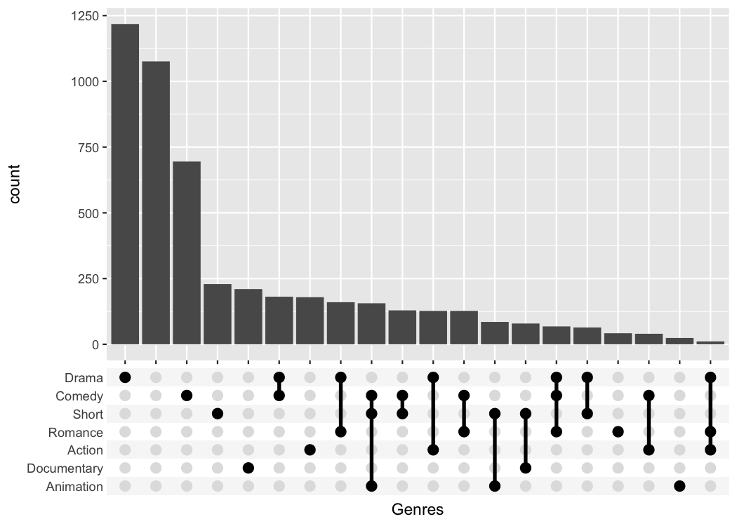
The best feature about ggupset is that it plays well
with existing tricks from ggplot2. For example, you can
easily add the size of the counts on top of the bars with this trick
from stackoverflow
tidy_movies %>%
  distinct(title, year, length, .keep_all=TRUE) %>%
  ggplot(aes(x=Genres)) +
    geom_bar() +
    geom_text(stat='count', aes(label=after_stat(count)), vjust=-1) +
    scale_x_upset(n_intersections = 20) +
    scale_y_continuous(breaks = NULL, lim = c(0, 1350), name = "")
#> Warning: Removed 100 rows containing non-finite outside the scale range
#> (`stat_count()`).
#> Removed 100 rows containing non-finite outside the scale range
#> (`stat_count()`).
Often enough the raw data you are starting with is not in such a neat
tidy shape. But that is a prerequisite to make such ggupset
plots, so how can you get from wide dataset to a useful one? And how to
actually create a list-column, anyway?
Imagine we measured for a set of genes if they are a member of certain pathway. A gene can be a member of multiple pathways and we want to see which pathways have a large overlap. Unfortunately, we didn’t record the data in a tidy format but as a simple matrix.
A ficitional dataset of this type is provided as
gene_pathway_membership variable
data("gene_pathway_membership")
gene_pathway_membership[, 1:7]
#>                                Aco1  Aco2  Aif1 Alox8   Amh Bmpr1b Cdc25a
#> Actin dependent Cell Motility FALSE FALSE FALSE FALSE FALSE  FALSE  FALSE
#> Chemokine Secretion            TRUE FALSE  TRUE  TRUE FALSE  FALSE  FALSE
#> Citric Acid Cycle              TRUE  TRUE FALSE FALSE FALSE  FALSE  FALSE
#> Mammalian Oogenesis           FALSE FALSE FALSE FALSE  TRUE   TRUE  FALSE
#> Meiotic Cell Cycle            FALSE FALSE FALSE FALSE FALSE  FALSE   TRUE
#> Neuronal Apoptosis            FALSE FALSE FALSE FALSE FALSE  FALSE  FALSE
We will now turn first turn this matrix into a tidy tibble and then plot it
tidy_pathway_member <- gene_pathway_membership %>%
  as_tibble(rownames = "Pathway") %>%
  gather(Gene, Member, -Pathway) %>%
  filter(Member) %>%
  select(- Member)

tidy_pathway_member
#> # A tibble: 44 × 2
#>    Pathway             Gene
#>    <chr>               <chr>
#>  1 Chemokine Secretion Aco1
#>  2 Citric Acid Cycle   Aco1
#>  3 Citric Acid Cycle   Aco2
#>  4 Chemokine Secretion Aif1
#>  5 Chemokine Secretion Alox8
#>  6 Mammalian Oogenesis Amh
#>  7 Mammalian Oogenesis Bmpr1b
#>  8 Meiotic Cell Cycle  Cdc25a
#>  9 Meiotic Cell Cycle  Cdc25c
#> 10 Chemokine Secretion Chia1
#> # ℹ 34 more rows
tidy_pathway_member is already a very good starting
point for plotting with ggplot. But we care about the genes
that are members of multiple pathways so we will aggregate the data by
Gene and create a list-column with the
Pathway information.
tidy_pathway_member %>%
  group_by(Gene) %>%
  summarize(Pathways = list(Pathway))
#> # A tibble: 37 × 2
#>    Gene   Pathways
#>    <chr>  <list>
#>  1 Aco1   <chr [2]>
#>  2 Aco2   <chr [1]>
#>  3 Aif1   <chr [1]>
#>  4 Alox8  <chr [1]>
#>  5 Amh    <chr [1]>
#>  6 Bmpr1b <chr [1]>
#>  7 Cdc25a <chr [1]>
#>  8 Cdc25c <chr [1]>
#>  9 Chia1  <chr [1]>
#> 10 Csf1r  <chr [1]>
#> # ℹ 27 more rows
tidy_pathway_member %>%
group_by(Gene) %>%
summarize(Pathways = list(Pathway)) %>%
ggplot(aes(x = Pathways)) +
geom_bar() +
scale_x_upset()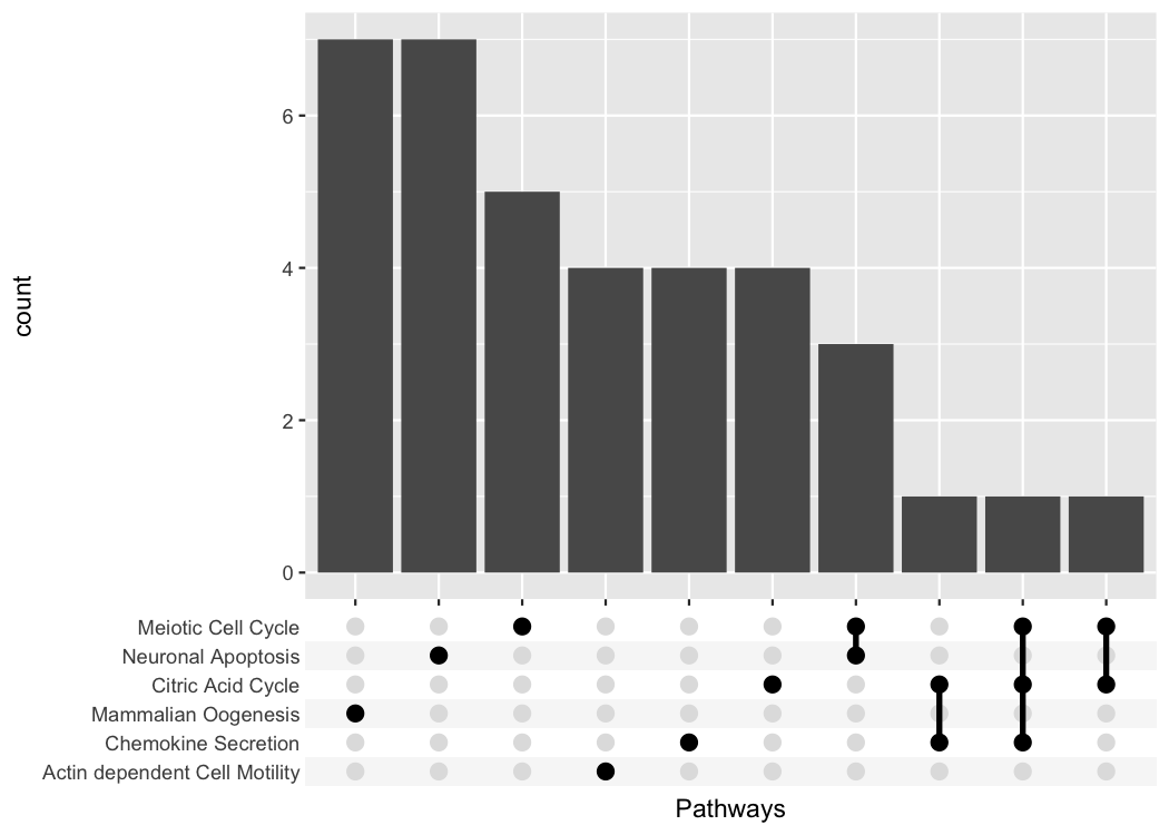
The first important idea is to realize that a list column is just as good as a character vector with the list elements collapsed
tidy_movies %>%
  distinct(title, year, length, .keep_all=TRUE) %>%
  mutate(Genres_collapsed = sapply(Genres, function(x) paste0(sort(x), collapse = "-"))) %>%
  select(title, Genres, Genres_collapsed)
#> # A tibble: 5,000 × 3
#>    title                                   Genres    Genres_collapsed
#>    <chr>                                   <list>    <chr>
#>  1 Ei ist eine geschissene Gottesgabe, Das <chr [1]> "Documentary"
#>  2 Hamos sto aigaio                        <chr [1]> "Comedy"
#>  3 Mind Benders, The                       <chr [0]> ""
#>  4 Trop (peu) d'amour                      <chr [0]> ""
#>  5 Crystania no densetsu                   <chr [1]> "Animation"
#>  6 Totale!, La                             <chr [1]> "Comedy"
#>  7 Visiblement je vous aime                <chr [0]> ""
#>  8 Pang shen feng                          <chr [2]> "Action-Animation"
#>  9 Not as a Stranger                       <chr [1]> "Drama"
#> 10 Autobiographia Dimionit                 <chr [1]> "Drama"
#> # ℹ 4,990 more rows
We can easily make a plot using the strings as categorical axis labels
tidy_movies %>%
  distinct(title, year, length, .keep_all=TRUE) %>%
  mutate(Genres_collapsed = sapply(Genres, function(x) paste0(sort(x), collapse = "-"))) %>%
  ggplot(aes(x=Genres_collapsed)) +
    geom_bar() +
    theme(axis.text.x = element_text(angle=90, hjust=1, vjust=0.5))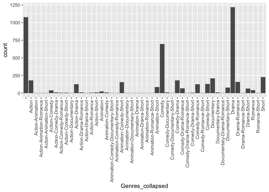
Because the process of collapsing list columns into delimited strings
is fairly generic, I provide a new scale that does this automatically
(scale_x_mergelist()).
tidy_movies %>%
  distinct(title, year, length, .keep_all=TRUE) %>%
  ggplot(aes(x=Genres)) +
    geom_bar() +
    scale_x_mergelist(sep = "-") +
    theme(axis.text.x = element_text(angle=90, hjust=1, vjust=0.5))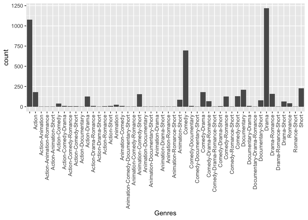
But the problem is that it can be difficult to read those labels.
Instead I provide a third function that replaces the axis labels with a
combination matrix (axis_combmatrix()).
tidy_movies %>%
  distinct(title, year, length, .keep_all=TRUE) %>%
  ggplot(aes(x=Genres)) +
    geom_bar() +
    scale_x_mergelist(sep = "-") +
    axis_combmatrix(sep = "-")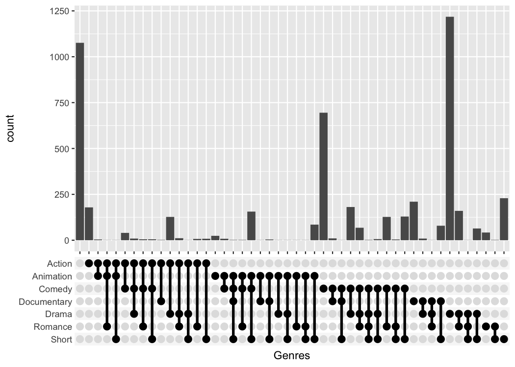
One thing that is only possible with the scale_x_upset()
function is to automatically order the categories and genres by
freq or by degree.
tidy_movies %>%
  distinct(title, year, length, .keep_all=TRUE) %>%
  ggplot(aes(x=Genres)) +
    geom_bar() +
    scale_x_upset(order_by = "degree")
#> Warning: Removed 1076 rows containing non-finite outside the scale range
#> (`stat_count()`).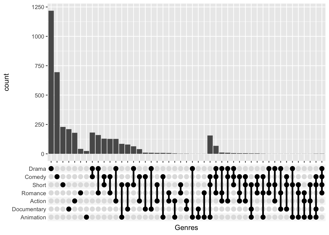
To make publication ready plots, you often want to have complete
control how each part of a plot looks. This is why I provide an easy way
to style the combination matrix. Simply add a
theme_combmatrix() to the plot.
tidy_movies %>%
  distinct(title, year, length, .keep_all=TRUE) %>%
  ggplot(aes(x=Genres)) +
    geom_bar() +
    scale_x_upset(order_by = "degree") +
    theme_combmatrix(combmatrix.panel.point.color.fill = "green",
                     combmatrix.panel.line.size = 0,
                     combmatrix.label.make_space = FALSE)
#> Warning: Removed 1076 rows containing non-finite outside the scale range
#> (`stat_count()`).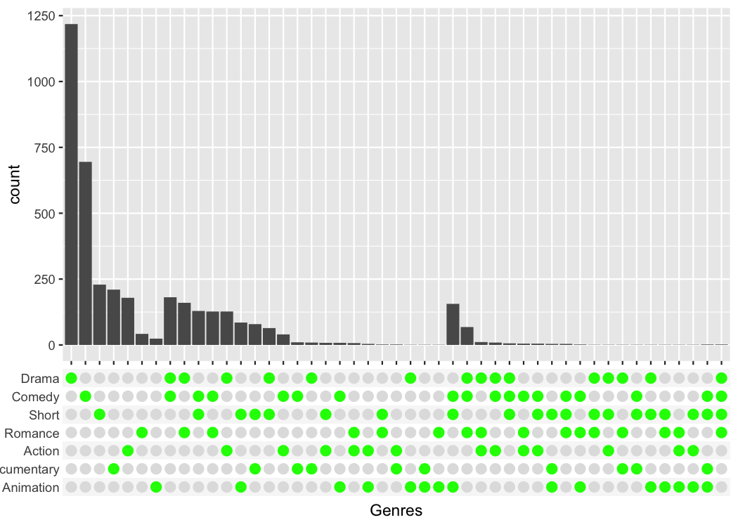
Sometimes the limited styling options using
combmatrix.panel.point.color.fill are not enough. To fully
customize the combination matrix plot, axis_combmatrix has
an override_plotting_function parameter, that allows us to
plot anything in place of the combination matrix.
Let us first reproduce the standard combination plot, but use the
override_plotting_function parameter to see how it
works:
tidy_movies %>%
  distinct(title, year, length, .keep_all=TRUE) %>%
  ggplot(aes(x=Genres)) +
    geom_bar() +
    scale_x_mergelist(sep = "-") +
    axis_combmatrix(sep = "-", override_plotting_function = function(df){
      ggplot(df, aes(x= at, y= single_label)) +
        geom_rect(aes(fill= index %% 2 == 0), ymin=df$index-0.5, ymax=df$index+0.5, xmin=0, xmax=1) +
        geom_point(aes(color= observed), size = 3) +
        geom_line(data= function(dat) dat[dat$observed, ,drop=FALSE], aes(group = labels), linewidth= 1.2) +
        ylab("") + xlab("") +
        scale_x_continuous(limits = c(0, 1), expand = c(0, 0)) +
        scale_fill_manual(values= c(`TRUE` = "white", `FALSE` = "#F7F7F7")) +
        scale_color_manual(values= c(`TRUE` = "black", `FALSE` = "#E0E0E0")) +
        guides(color="none", fill="none") +
        theme(
          panel.background = element_blank(),
          axis.text.x = element_blank(),
          axis.ticks.y = element_blank(),
          axis.ticks.length = unit(0, "pt"),
          axis.title.y = element_blank(),
          axis.title.x = element_blank(),
          axis.line = element_blank(),
          panel.border = element_blank()
        )
    })
We can use the above template, to specifically highlight for example all sets that include the Action category.
tidy_movies %>%
  distinct(title, year, length, .keep_all=TRUE) %>%
  ggplot(aes(x=Genres)) +
    geom_bar() +
    scale_x_mergelist(sep = "-") +
    axis_combmatrix(sep = "-", override_plotting_function = function(df){
      print(class(df))
      print(df)
      df %>%
        mutate(action_movie = case_when(
          ! observed ~ "not observed",
          map_lgl(labels_split, ~ "Action" %in% .x) ~ "Action",
          observed ~ "Non-Action"
        )) %>%
        ggplot(aes(x = at, y = single_label)) +
          geom_rect(aes(fill = index %% 2 == 0), ymin=df$index-0.5, ymax=df$index+0.5, xmin=0, xmax=1) +
          geom_point(aes(color = action_movie), size = 3) +
          geom_line(data= function(dat) dat[dat$observed, ,drop=FALSE], aes(group = labels, color = action_movie), linewidth= 1.2) +
          ylab("") + xlab("") +
          scale_x_continuous(limits = c(0, 1), expand = c(0, 0)) +
          scale_fill_manual(values= c(`TRUE` = "white", `FALSE` = "#F7F7F7")) +
          scale_color_manual(values= c("Action" = "red", "Non-Action" = "black", "not observed" = "lightgrey")) +
          guides(fill="none") +
          theme(
            legend.position = "bottom",
            panel.background = element_blank(),
            axis.text.x = element_blank(),
            axis.ticks.y = element_blank(),
            axis.ticks.length = unit(0, "pt"),
            axis.title.y = element_blank(),
            axis.title.x = element_blank(),
            axis.line = element_blank(),
            panel.border = element_blank()
          )
    }) +
    theme(combmatrix.label.total_extra_spacing = unit(30, "pt"))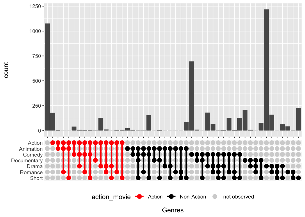
#> [1] "tbl_df"     "tbl"        "data.frame"
#> # A tibble: 336 × 7
#>    labels                  single_label    id labels_split     at observed index
#>    <ord>                   <ord>        <int> <list>        <dbl> <lgl>    <dbl>
#>  1 ""                      Short            1 <chr [0]>    0.0124 FALSE        1
#>  2 "Action"                Short            2 <chr [1]>    0.0332 FALSE        1
#>  3 "Action-Animation"      Short            3 <chr [2]>    0.0539 FALSE        1
#>  4 "Action-Animation-Roma… Short            4 <chr [3]>    0.0747 FALSE        1
#>  5 "Action-Animation-Shor… Short            5 <chr [3]>    0.0954 TRUE         1
#>  6 "Action-Comedy"         Short            6 <chr [2]>    0.116  FALSE        1
#>  7 "Action-Comedy-Drama"   Short            7 <chr [3]>    0.137  FALSE        1
#>  8 "Action-Comedy-Romance" Short            8 <chr [3]>    0.158  FALSE        1
#>  9 "Action-Comedy-Short"   Short            9 <chr [3]>    0.178  TRUE         1
#> 10 "Action-Documentary"    Short           10 <chr [2]>    0.199  FALSE        1
#> # ℹ 326 more rows
The override_plotting_function is incredibly powerful,
but also an advanced feature that comes with pitfalls. Use at your own
risk.
There is already a package called UpSetR (GitHub, CRAN) that provides
very similar functionality and that heavily inspired me to write this
package. It produces a similar plot with an additional view that shows
the overall size of each genre.
# UpSetR
tidy_movies %>%
  distinct(title, year, length, .keep_all=TRUE) %>%
  unnest(cols = Genres) %>%
  mutate(GenreMember=1) %>%
  pivot_wider(names_from = Genres, values_from = GenreMember, values_fill = list(GenreMember = 0)) %>%
  as.data.frame() %>%
  UpSetR::upset(sets = c("Action", "Romance", "Short", "Comedy", "Drama"), keep.order = TRUE)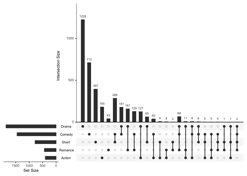
# ggupset
tidy_movies %>%
  distinct(title, year, length, .keep_all=TRUE) %>%
  ggplot(aes(x=Genres)) +
    geom_bar() +
    scale_x_upset(order_by = "degree", n_sets = 5)
#> Warning: Removed 1311 rows containing non-finite outside the scale range
#> (`stat_count()`).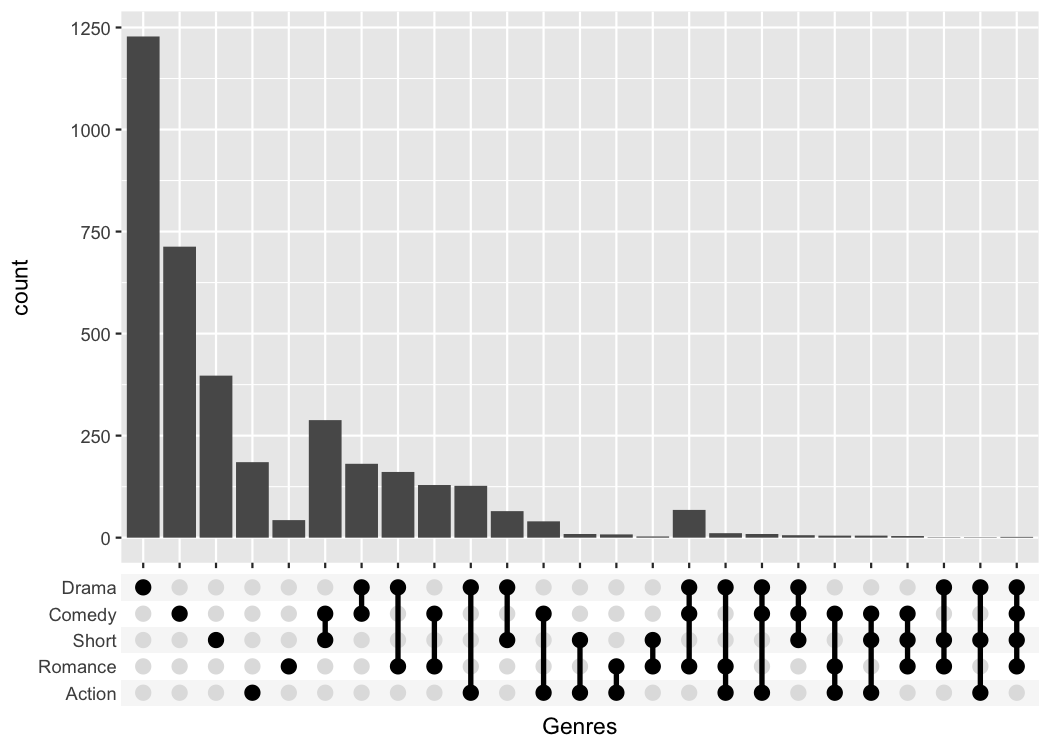
The UpSetR package provides a lot convenient helpers
around this kind of plot; the main advantage of my package is that it
can be combined with any kind of ggplot that uses a categorical x-axis.
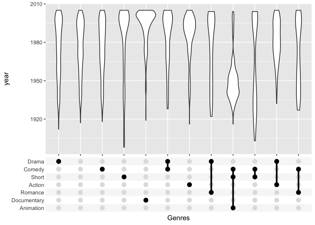
This additional flexibility can be useful if you want to create
non-standard plots. The following plot for example shows when movies of
a certain genre were published.
tidy_movies %>%
  distinct(title, year, length, .keep_all=TRUE) %>%
  ggplot(aes(x=Genres, y=year)) +
    geom_violin() +
    scale_x_upset(order_by = "freq", n_intersections = 12)
#> Warning: Removed 513 rows containing non-finite outside the scale range
#> (`stat_ydensity()`).
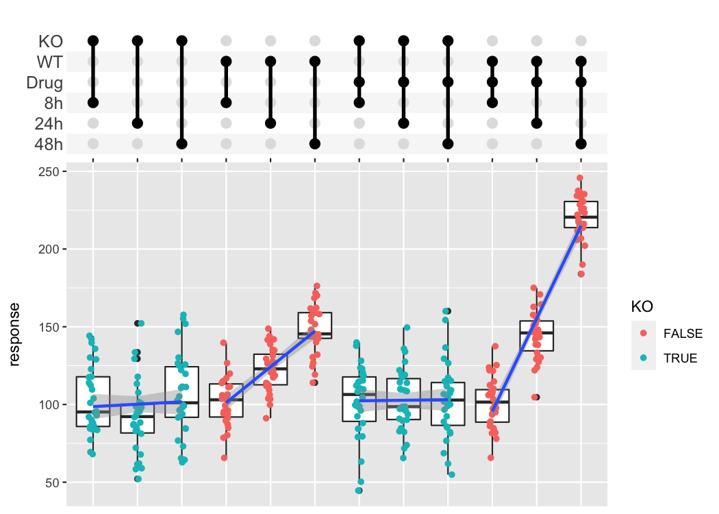
The combination matrix axis can be used to show complex experimental designs, where each sample got a combination of different treatments.
df_complex_conditions
#> # A tibble: 360 × 4
#>    KO    DrugA Timepoint response
#>    <lgl> <chr>     <dbl>    <dbl>
#>  1 TRUE  Yes           8     84.3
#>  2 TRUE  Yes           8    105.
#>  3 TRUE  Yes           8     79.1
#>  4 TRUE  Yes           8    140.
#>  5 TRUE  Yes           8    108.
#>  6 TRUE  Yes           8     79.5
#>  7 TRUE  Yes           8    112.
#>  8 TRUE  Yes           8    118.
#>  9 TRUE  Yes           8    114.
#> 10 TRUE  Yes           8     92.4
#> # ℹ 350 more rows

df_complex_conditions %>%
  mutate(Label = pmap(list(KO, DrugA, Timepoint), function(KO, DrugA, Timepoint){
    c(if(KO) "KO" else "WT", if(DrugA == "Yes") "Drug", paste0(Timepoint, "h"))
  })) %>%
  ggplot(aes(x=Label, y=response)) +
    geom_boxplot() +
    geom_jitter(aes(color=KO), width=0.1) +
    geom_smooth(method = "lm", aes(group = paste0(KO, "-", DrugA))) +
    scale_x_upset(order_by = "degree",
                  sets = c("KO", "WT", "Drug", "8h", "24h", "48h"),
                  position="top", name = "") +
    theme_combmatrix(combmatrix.label.text = element_text(size=12),
                     combmatrix.label.extra_spacing = 5)
#> `geom_smooth()` using formula = 'y ~ x'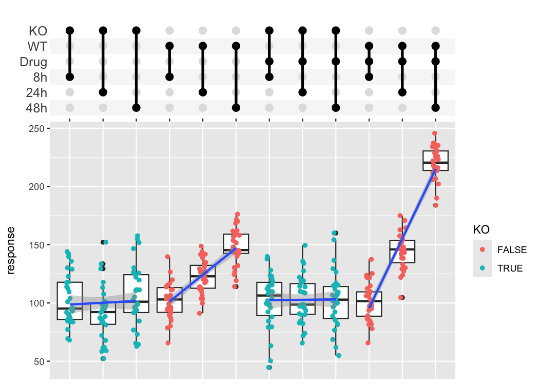
dplyr currently does not support list columns as
grouping variables. In that case it makes sense to collapse it manually
and use the axis_combmatrix() function to get a good
looking plot.
# Percentage of votes for n stars for top 12 genres
avg_rating <- tidy_movies %>%
  mutate(Genres_collapsed = sapply(Genres, function(x) paste0(sort(x), collapse="-"))) %>%
  mutate(Genres_collapsed = fct_lump(fct_infreq(as.factor(Genres_collapsed)), n=12)) %>%
  group_by(stars, Genres_collapsed) %>%
  summarize(percent_rating = sum(votes * percent_rating)) %>%
  group_by(Genres_collapsed) %>%
  mutate(percent_rating = percent_rating / sum(percent_rating)) %>%
  arrange(Genres_collapsed)
#> `summarise()` has grouped output by 'stars'. You can override using the
#> `.groups` argument.

avg_rating
#> # A tibble: 130 × 3
#> # Groups:   Genres_collapsed [13]
#>    stars Genres_collapsed percent_rating
#>    <dbl> <fct>                     <dbl>
#>  1     1 Drama                    0.0437
#>  2     2 Drama                    0.0411
#>  3     3 Drama                    0.0414
#>  4     4 Drama                    0.0433
#>  5     5 Drama                    0.0506
#>  6     6 Drama                    0.0717
#>  7     7 Drama                    0.129
#>  8     8 Drama                    0.175
#>  9     9 Drama                    0.170
#> 10    10 Drama                    0.235
#> # ℹ 120 more rows

# Plot using the combination matrix axis
# the red lines indicate the average rating per genre
ggplot(avg_rating, aes(x=Genres_collapsed, y=stars)) +
    geom_tile(aes(fill=percent_rating)) +
    stat_summary_bin(aes(y=percent_rating * stars), fun = sum,  geom="point",
                     shape="—", color="red", size=6) +
    axis_combmatrix(sep = "-", levels = c("Drama", "Comedy", "Short",
                    "Documentary", "Action", "Romance", "Animation", "Other")) +
    scale_fill_viridis_c()
There is an important pitfall when trying to save a plot with a
combination matrix. When you use ggsave(), ggplot2
automatically saves the last plot that was created. However, here
last_plot() refers to only the combination matrix. To store
the full plot, you need to explicitly assign it to a variable and save
that.
pl <- tidy_movies %>%
  distinct(title, year, length, .keep_all=TRUE) %>%
  ggplot(aes(x=Genres)) +
    geom_bar() +
    scale_x_upset(n_intersections = 20)
ggsave("/tmp/movie_genre_barchart.png", plot = pl)
#> Saving 7 x 5 in imagesessionInfo()
#> R version 4.3.2 (2023-10-31)
#> Platform: x86_64-apple-darwin20 (64-bit)
#> Running under: macOS Sonoma 14.5
#>
#> Matrix products: default
#> BLAS: /Library/Frameworks/R.framework/Versions/4.3-x86_64/Resources/lib/libRblas.0.dylib
#> LAPACK: /Library/Frameworks/R.framework/Versions/4.3-x86_64/Resources/lib/libRlapack.dylib; LAPACK version 3.11.0
#>
#> locale:
#> [1] en_US.UTF-8/en_US.UTF-8/en_US.UTF-8/C/en_US.UTF-8/en_US.UTF-8
#>
#> time zone: Europe/Berlin
#> tzcode source: internal
#>
#> attached base packages:
#> [1] stats graphics grDevices utils datasets methods base
#>
#> other attached packages:
#> [1] ggupset_0.4.0 lubridate_1.9.3 forcats_1.0.0 stringr_1.5.1
#> [5] dplyr_1.1.4 purrr_1.0.2 readr_2.1.5 tidyr_1.3.1
#> [9] tibble_3.2.1 tidyverse_2.0.0 ggplot2_3.5.1
#>
#> loaded via a namespace (and not attached):
#> [1] utf8_1.2.4 generics_0.1.3 lattice_0.22-5 stringi_1.8.3
#> [5] hms_1.1.3 digest_0.6.34 magrittr_2.0.3 evaluate_0.23
#> [9] grid_4.3.2 timechange_0.3.0 fastmap_1.1.1 Matrix_1.6-5
#> [13] plyr_1.8.9 gridExtra_2.3 mgcv_1.9-1 fansi_1.0.6
#> [17] viridisLite_0.4.2 scales_1.3.0 UpSetR_1.4.0 textshaping_0.3.7
#> [21] cli_3.6.2 rlang_1.1.3 munsell_0.5.0 splines_4.3.2
#> [25] withr_3.0.0 yaml_2.3.8 tools_4.3.2 tzdb_0.4.0
#> [29] colorspace_2.1-0 vctrs_0.6.5 R6_2.5.1 lifecycle_1.0.4
#> [33] ragg_1.2.7 pkgconfig_2.0.3 pillar_1.9.0 gtable_0.3.4
#> [37] glue_1.7.0 Rcpp_1.0.12 systemfonts_1.0.5 xfun_0.42
#> [41] tidyselect_1.2.0 highr_0.10 rstudioapi_0.15.0 knitr_1.45
#> [45] farver_2.1.1 nlme_3.1-164 htmltools_0.5.7 rmarkdown_2.25
#> [49] labeling_0.4.3 compiler_4.3.2